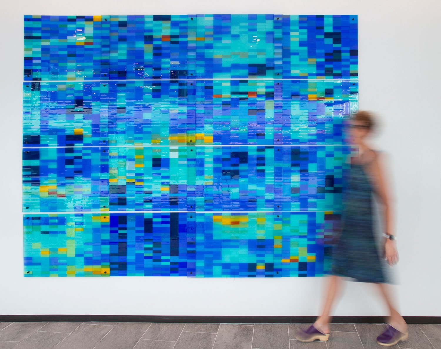
Scientists are intimately familiar with ‘heat charts’ fashioned on an x:y axis, each cell is color coded from deep blue to bright red depending on the relative ‘heat’ or score for that variable. For many researchers, these charts feel beautiful and hold surprising patterns with clusters of color and the occasional outlier that offers a burst of yellow. Personally, I LOVE them. This was a chance to make an almost 8x10 ft installation in the Anschutz Medical Sciences building on the University of Colorado Campus in Aurora, CO. 16 overlapping kiln-fired fused glass panels installed in 2022.
1
2
3
4
5
6
7
8


