How does data tell a story with large scale physical art installations
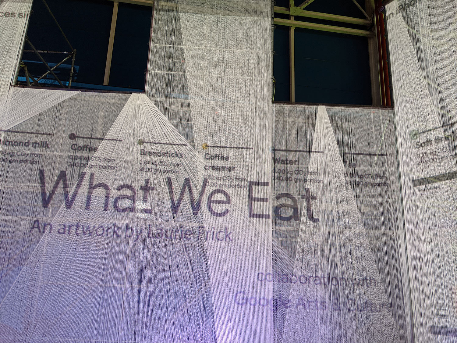
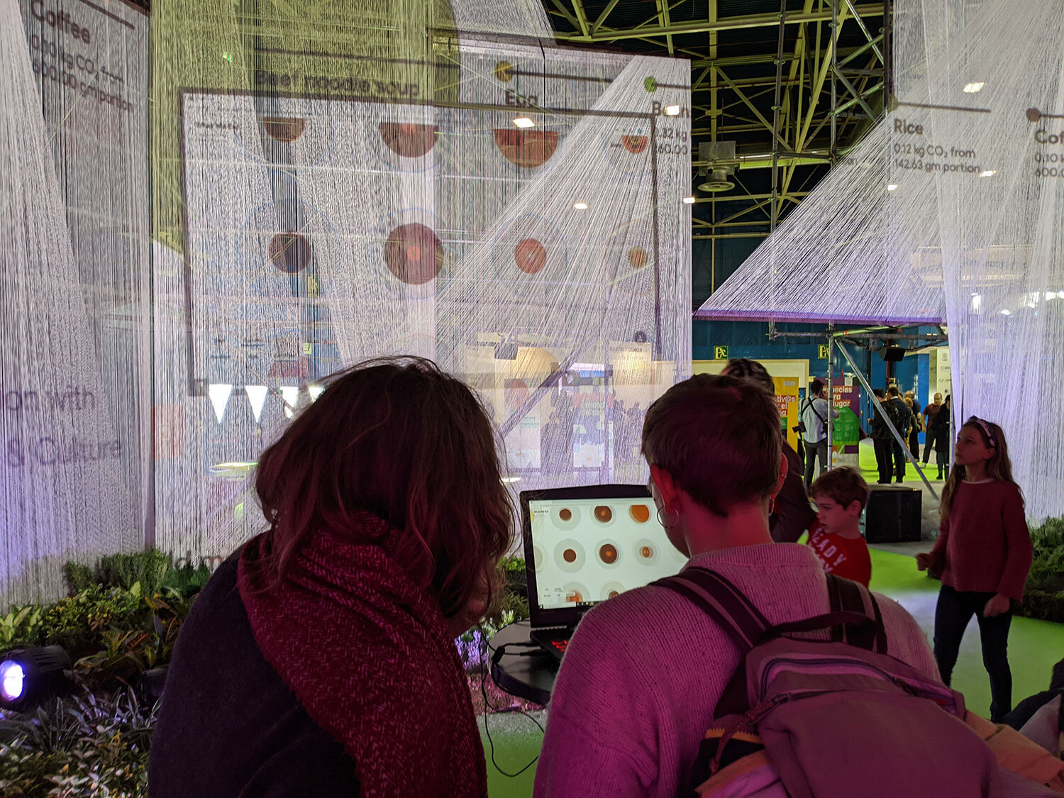
/What We Eat by Laurie Frick and built by Zigzag in Germany in 2019, installation at COP25, Madrid.
My projects use data to tell a story that unfolds over time, the viewer is initially struck by colorful pattern that feels organic and handmade. This year I completed an interactive online project for Google Arts & Culture in London to highlight their environmental initiative. “What We Eat” used actual daily diets of thousands of people from the US, France and UK measured by the CO2 carbon footprint of each food item turned it into colorful pattern, the viewer could also create their own diet to compare. It’s a subtle way to show the dramatic difference for food choices. Google built a huge physical installation of the work at COP25, the climate conference in Madrid 2019. And you can play with the interactive app online at www.experiments.withgoogle.com
My foray into kiln fired glass started with a request to design a 5 story high stairwell covering for the outside of a new condominium building in West Hollywood. Very exciting to produce something so visible. Lots of building codes dictate how the 8 ft wide x 60 ft tall space can screen an outdoor stairwell, open, closed and size of holes are very particular. I wanted it to read as single vertical gesture and be satisfying for the tenant that walked up those stairs everyday and saw it up close to – and still striking to the people who would drive by that busy corner near Fairfax and Santa Monica Blvd. I used north and southbound traffic data by time of day to produce an overlapping colorful pattern that is graphic and memorable. Started 2 years ago, it installs 4Q 2020.
The outdoor mural in Austin, Texas was funded by the Hotel Occupancy tax, the RFP asked to make something that related to Austin visitors. The 500 ft underpass was dingy, weed and rock strewn under the railroad tracks, but a new Whole Foods and a number of condo buildings had opened nearby. Hardly anyone walked this route. The budget was only $50K and the scale of the project enormous. Initially it was a one year temporary installation that got extended to two years. I used actual visitor data for the simple striped pattern that was easy to paint. 16 panel art signs were covered with outdoor upholstery in the colors of the 16 most instagrammed Austin murals. Installed 2 years ago, we established a small budget for graffiti removal – and the mural and upholstery look as good today as the day it was installed (big endorsement for sunbrella fabrics). Lots and lots of pedestrians and cyclists now use that path. I was wowed by the power of art to change the experience and feel of a space.


